Convenience VS. Diegesis: The battle for immersion, and how playing with the map off makes Assassin’s Creed that much more fun.
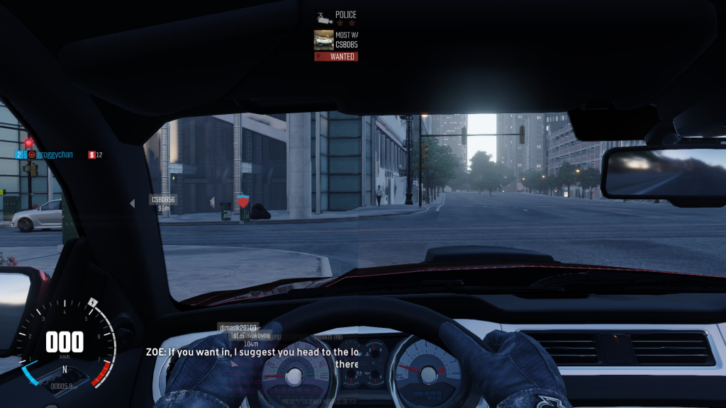
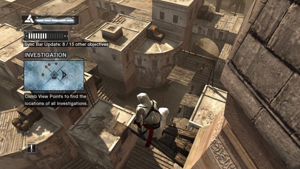
There’s a problem that plagues a lot of modern games, open-world sandbox games specifically – or, to be even more specific, the ones made by Ubisoft. Whether you’re playing Assassin’s Creed, Far Cry or The Crew, it’s the same song and dance: You’re thrown in a big open world and given a ton of dots to follow on a minimap and quests to mark off your checklist. But all those tantalizing goals soon become a guiding thread, dragging you by the hand from one quest to the next, to the point where all the freedom that these games claim to give you seems meaningless, all the while the game plasters markers, progress bars, chat windows and mini-map icons on your screen to distract you from what’s happening in the game itself.
But there’s an easy solution to all that noise; turn it off.
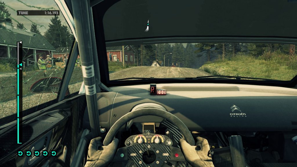
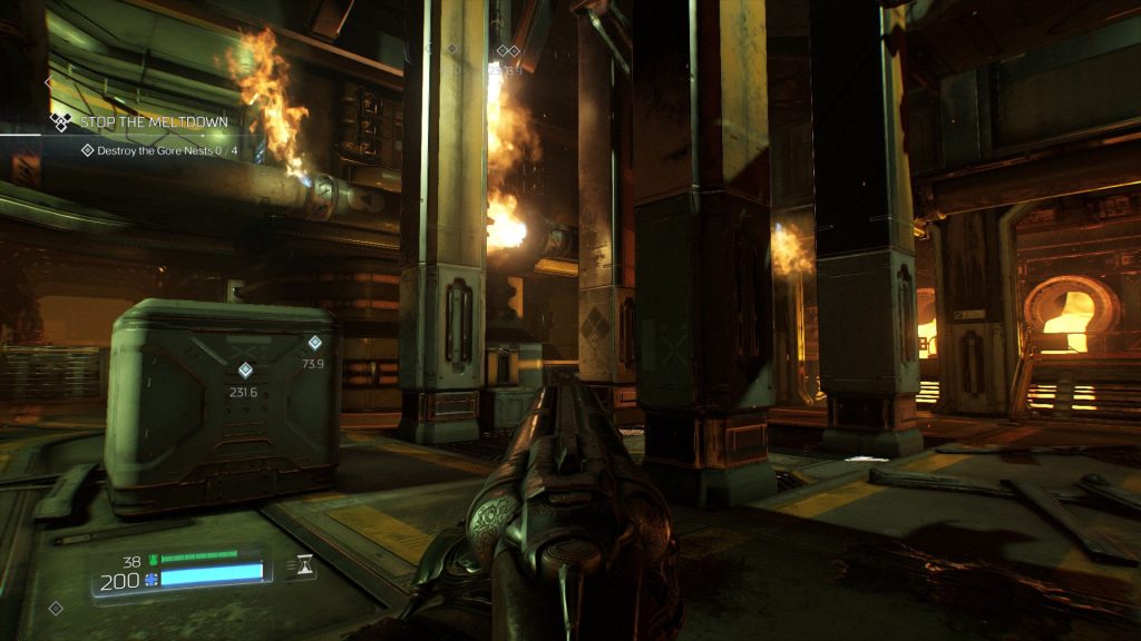
When it comes to the heads-up displays used in many games, one of the core concepts standing between user-friendliness and immersing the player is diegesis – the separation between what is happening in the world of the game versus what isn’t. Usually HUDs are non-diegetic: in DOOM for example, the Marine isn’t really looking at health and ammo meters at the bottom of his field of vision, but these are just there for the player’s convenience. However, this distinction becomes a lot more important when games try to focus exclusively on diegetic elements as a means of immersion, highlighting how important it is to convey information that’s difficult to visualize in a way that works in the fiction of the game.
Of course, there have been attempts to eschew HUDs entirely in games: Jurassic Park: Trespasser is an infamous failed experiment in HUDlessness, where combining a hard-to-control 3D arm with a lack of crosshairs made things exponentially more difficult. But it was another movie license game about shooting dinosaurs on an island, the pompously titled Peter Jackson’s King Kong: The Official Game of the Movie, that made much better use of a minimalistic interface. Funnily enough, both games feature their main characters saying out loud how much ammo their guns are holding to compensate for a lack of on-screen ammo counter, and Trespasser’s protagonist actually has a heart-shaped tattoo on her breast to represent her health levels – a creative solution, but perhaps not the most elegant one.
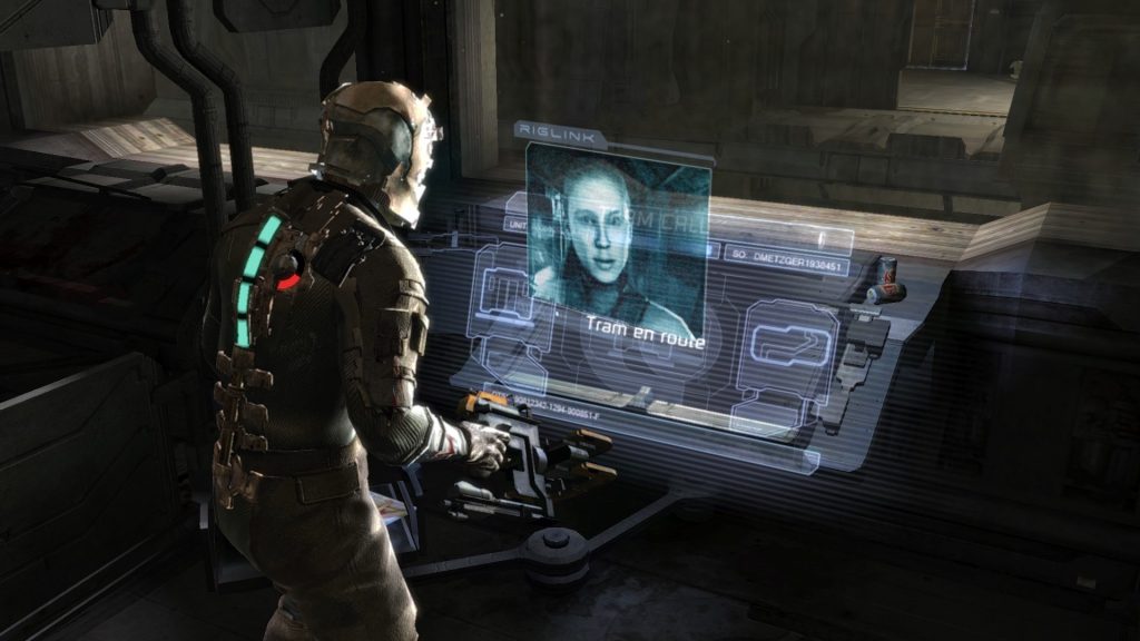
There is of course a happy medium between providing as immersive an experience a possible and giving the player all the information they need, but it takes a deft hand and creative design to implement these solutions. Some third-person games like Dead Space and Ghostbusters have found ways to display the character’s health on their suits, as well as using in-game holograms to display any UI elements, providing all the necessary information completely diegetically. The Metro series is also known for using HUD elements only when absolutely necessary, further highlight the claustrophobic terror of its setting. Other games still can be modded to only display HUD elements as they’re needed, letting the player enjoy the environments on their travels.
While some games do require a certain amount of non-diegetic information, others seem almost tailor-made for a HUD-free challenge. The recent reboot of DOOM is an especially satisfying example: The game is completely playable even without crosshairs when placing the gun in the middle of the screen (just like classic DOOM!), and its health mechanics make sure that long-term health management isn’t an issue. Even with the HUD off, the game still gives you helpful audiovisual cues to let you know how close you are to death, perfect for a HUD-free challenge.
Assassin’s Creed specifically becomes a completely different game when played with the HUD off, and a much better one at that: Rather than climbing towers to unlock dots on your map, your actual reason to scale those towers is to scout out the goals with your own eyes. With the HUD off, the game lets you do the exact things that Altair is doing by yourself, turning the game from a series of simplistic and repetitive quests into something much more meaningful when you get to do it all by your own wit.
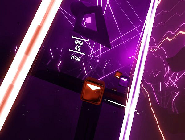
There’s also another emerging benefit from using diegetic elements to convey information to the player, and that is the proliferation of VR. Since 2D user interface elements are always going to look awkward plastered in front of the player’s face on a VR display, developers have to find new ways to show that information to the player, or just make do without them. Better still, relying only on those diegetic elements further increases the player’s immersion in its world, which goes hand-in-hand with the stated goals of VR in general.
So if you’re as tired of blindly following waypoints on a minimap as I am, and if you really want to give yourself a challenge and truly immerse yourself in a game’s world, just try turning the HUD off. You’ll thank me later.
You might also like
More from Features
Game Awards – Celebration of talent or a Marketing Extravaganza?
The Game Awards 2024 is over and the winners are announced. However, are they still following the same pattern that …
Worlds in a Finnish Theater: League Finals, Community, and Döner Kebab
I travelled to Helsinki to watch League finals in a cinema, and it was worth it. #leagueoflegends #esports #community #worldfinals


