The decline of video game cover art
During the holidays, I visited my folks’ home, where my collection of Amiga and “big box” PC games reside. As I browsed through the shelves, I started thinking about how generic game cover art has become during the last decade.
If you take a look at the list of bestselling video games of the last 10 years, you’ll notice a pattern: most games tend to feature the protagonist(s) on the cover, either striking a pose or a close up shot of their face. Either that, or just some guy with a gun in case of action and FPS games like Dark Souls and Call of Duty (pick any installment). Of course there are exceptions, like the stylized multi panel collages used by the Grand Theft Auto games, which are so iconic that they spawned a parody meme.
As a (former) game collector, I’ve seen enough cover art pictures in my day to notice a downward trend when it comes to how evocative and memorable video game cover art pictures are. Of course, in any given creative medium, the vast majority of works will always consist of mediocrity. But I think that if you were to create a timeline of the most iconic, impressive and ingenious cover art pictures, the 80s and 90s would be far more densely filled than the 00s and 10s.
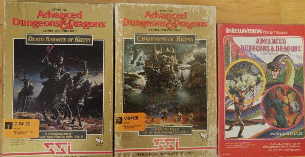
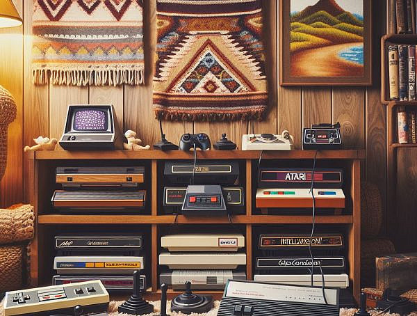
It didn’t take long for the budding video game industry of the late 70s to start producing memorable works in the field of cover artistry. Atari 2600 and Intellivision games featured extremely primitive graphics, but their packaging was often adorned with detailed fantasy and sci-fi illustrations reminiscent of hand-drawn movie posters and album covers of the era. Depending on how you look at it, you could either see these images as false advertising, or additional visual stimulus the publishers provided to help players use their imagination while playing these games. A vivid imagination was certainly required to appreciate the highly abstract visuals of those early console games.
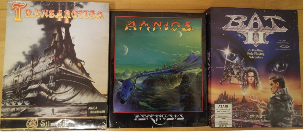
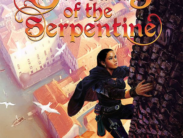
Video games started hitting their stride in late 80s, and soon after the industry witnessed the heyday of cover art as well. European 16-bit home computer games in particular featured memorable cover art. Works of actual painters like Rodney Matthews, Roger Dean and Luis Royo adorned the packaging of Atari ST and Amiga games such as Transarctica, Shadow of the Beast and BAT 2. UK developer Psygnosis springs to mind as the most prominent proponent of cover artistry from this time period. Even completely forgettable games like Awesome and Amnios featured mindblowing art work in their boxes. The fantasy vistas of aforementioned illustrators were so influential amongst European Amiga game developers that you could see their aesthethic seep into the graphical style of games such as Lionheart and Ambermoon.
Console games had their share of memorable covers as well, Final Fantasy 6, Crying and Legend of Mana come to mind as examples of 16-bit titles with evocative covers. The concept of hiring established artists to work on video games wasn’t unheard of in Japan either, from Dragon Ball creator Akira Toriyama doing character designs in Chrono Trigger to the renowned French cartoonist Jean Giraurd drawing the Japanese cover art of Panzer Dragoon.
But the greatness of 90s cover art isn’t limited to just visual fidelity. The completely black cover of Ultima VII is striking, as are the simplistic logos of Quake and Blood. The beautiful thing about 90s cover art design was its diversity; boxes felt more like artistic statements in the case of aforementioned titles. There was also the physical dimension in PC games’ case, which weren’t in any way standardized: unusually sized and shaped boxes, feelies, embedded logo pictures etc. The packaging was just less homogenous.
Of course, there’s no correlation between the quality of a game and its cover art picture. Many of those previously mentioned Psygnosis titles were all style and no substance, while artistically significant turn of the millennium titles such Planescape: Torment and Deus Ex were some of the progenitors of the “protagonists face on the cover art”-trend. And the reasons behind this decline in craftsmanship are simple: digital sales and reduced significance of physical ownership. As consumers migrate to e-commerce venues, a game’s cover doesn’t need to stand out from a store shelf. And digital DRM has removed the need for analog copy protection on PC games. Similarly, in-game maps and elaborate tutorials have replaced the physical component of games like Ultima IV, where map reading, note taking and elaborate manuals were a part of the experience.
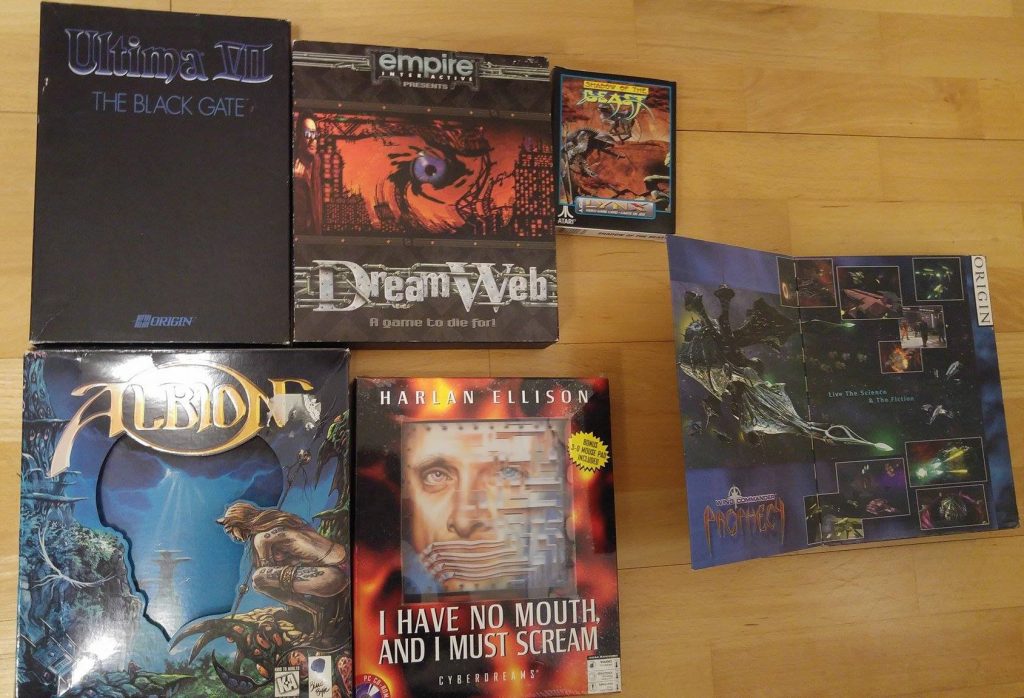
Some examples of diverse box design: DreamWeb came packaged with a bloody journal written by the protagonist, Albion has a “3-dimensional” cover while I have no Mouth, and I must Scream features a reflective mousepad in its cover.
Still, you’d imagine that multimillion dollar projects like Bioshock: Infinite could invest more into the cover. You don’t judge a book by its cover, but I feel that a memorable cover art image, like that of ICO, adds to the feeling of gesamtkunstwerk in a masterpiece. I can’t help to think that this all feels like the commodification of our beloved medium, as interchangeable cover art pictures have become the norm in AAA titles.
You might also like
More from Features
Game Awards – Celebration of talent or a Marketing Extravaganza?
The Game Awards 2024 is over and the winners are announced. However, are they still following the same pattern that …
Worlds in a Finnish Theater: League Finals, Community, and Döner Kebab
I travelled to Helsinki to watch League finals in a cinema, and it was worth it. #leagueoflegends #esports #community #worldfinals


